Work | Blurb

George is a traditional barber based in central London, and when he started to develop his own range of hair care products he asked us to help him with the packaging. Despite the products containing minimal synthetics, he wanted something different from the usual “natural” or scientific clichés. Playing with the idea of “By George” as both an expression and a statement, we developed the jaunty central graphic to give the range a strong consistent identity.

Branding

The brief was to create a brand that reflected the owners attention to detail, as well as his passion for sustainability and the environment. The brewery being based in Kew, it seemed natural to refer to botanical imagery of old, and use it to differentiate the new brand from the standard craft beer look. It gives Kew their own distinct, ownable space in what has become a very crowded sector.

“Thank you for all your hard work and inspiration on MLP. You have helped make it the most important program we have within GSKCH at the present time.”

Pete Dornsife,
GLAXOSMITHKLINE

MLP was a massive 10-year programme for GlaxoSmithKline to give their marketing function guidance and tools for best-practice marketing. We developed the overall brand and expanded it into a series of workshop materials as well as back-up print and online reference.

It was a great project to work on - bringing complex and detailed material to life for the participants, and for what we learnt along the way.
Storegga, specialising in carbon capture and storage (CCS), had recently acquired Pale-Blu, a blue hydrogen company and asked us for a rebrand that better reflected the new group, one which would not be limited to just CCS or hydrogen. We proposed a strong simple logotype, and incorporated the blue dot of the old company brand into the new brand for continuity. To support the new brand, we designed a series of textures to be used throughout their publicity.

Packaging

When Jordan Grand Prix decided to develop an energy drink, as part of an overall programme of brand extensions, they wanted the drink to reflect the brand values of Jordan and the excitement of Formula 1. We settled on a waisted bottle shape with an “energy bulge” to suggest the power of the drink and which feels great in the hand, then developed a series of graphics to give the bottle the signature look of a heavily sponsored Formula 1 race car.
The guys from Reunion came to see us on the back of our work for Kew Brewery. They have a very different approach to brewing and wanted a different look to the typical craft brewers. Equally they were keen to set themselves apart from the more traditional brewers. We developed a visual language using patterns as a common theme, creating a bright and ebullient brand that has evolved as the beer range grows...
...and when they decided to move into the keg and can market, Reunion asked us to develop a more “modern” version of their brand. Keeping to the established visual language of patterns, we took as our inspiration ‘dazzle ships’ to produce a disrupted pattern version of the logo, accented in flat and metallic inks to give the cans a dynamic shimmer.

“The results speak for themselves... I had high hopes for significant progress but I never imagined that we could see such an improvement.”

Steve Hayes
LUMIE

Outside In (as they then were) commissioned us to help them with their new wake up lights. We developed the Lumie brand, and Bodyclock range name to give the devices a reassuring friendly face. We urged them to invest in product design and to see it as an important part of the new brand essence. The results were so successful the company went on to market all of its products (they are renowned for their SAD lights) under the Lumie brand.

Retail

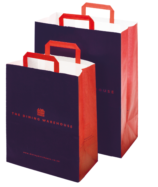
Mulberry Hall was one of the world's best fine china and crystal shops. With the trend towards informal dining the directors decided they needed to attract a more fashion-conscious market. We proposed a new venture aimed specifically at the target market - a “downstairs” to Mulberry Hall’s “upstairs”.

Using the kitchens of stately homes as inspiration, we specified bare brick walls, terracotta / york stone tiles and pitch pine fittings. To complement this stripped-back look we developed a rich blue and bright red brand, using fresh, informal sketches to convey the more youthful offering.
Showroom design for Mulberry Hall.
Exhibition design for the Design Council

Digital

Wordpress website for the Madeleine Milburn Literary Agency
Knowledge base intranet site for Citrix, built in xhtml.
Online Annual Review for the Centre for Science and Policy, University of Cambridge
E-commerce site for Mulberry Hall.

Print

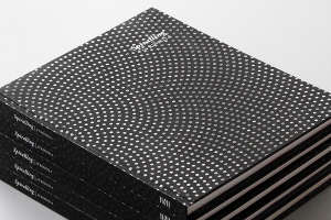
Spirals, a book of poems by John Kinsella, who was introduced to us by the Isaac Newton Insitute of Mathematics (an existing client). They wanted to publish the book as part of their anniversary celebrations and asked us to design the book for him. We worked with John on the overall look of the book, making (and taking - it being his book, John got really involved) suggestions for imagery and structure, based around the central theme of the mathematics of spirals.
Petro-Canada came to us needing a brochure to give to their seismic crews to help them identify any endangered species they might encounter. We suggested that a better way would be to produce a poster/chart, which would be much quicker and easier to refer to. They were so pleased with the result we were asked to rework it into a poster to donate to local schools in the region.

“Thank you so much for all of your ideas, creativity and last minute deadline responsiveness!”

Barry Horgan
PETRO-CANADA

Diageo were keen to persuade whisky drinkers to switch to their brands, so they mapped out their and competitor brands onto a flavour grid. They asked us to take the raw data and turn it into a useful marketing tool - we created a definitive “flavour map” and associated tools and helped Diageo develop a series of marketing assets for events and publicity. The example shown here is a leaflet we designed for insertion into the Sunday Times.
Panadol is one of GlaxoSmithKline's premier brands and they wanted to capture the experience of the Panadol brand teams from around the world. Examples of successful marketing ideas were gathered together and turned into an easy-to-use reference, that allow the teams to tap into ideas that had already been proven successful elsewhere. Bold graphics and colour make the extensive and detailed material feel manageable and navigable.
Over the past couple of years we’ve been working with a tech marketing company on a series of campaigns to sell IT solutions to business and industry. Made all the more relevant by two years of Covid and the ensuing WFH, the targeted campaign collateral has included printed matter, pdfs, e-blasts, landing pages and webinars (as well as the inevitable banner ads), all co-ordinated through Hubspot.
One in a series of illustrations of vintage motel and other neon totems showing how they might have looked in their heyday. Used in a US travel magazine article.
We’ve created various publications for Latymer Upper School - including their propectuses, and admissions guides. When we were asked to create a brochure to launch a fund raising campaign for their new sports hall, we were keen to give the campaign a human, emotional focus, rather than relying on the usual architect generated images of the proposed building. Photographs of current students going through their paces in their chosen sport help to emphasise the real benefits of the new space.
Infographic for Reunion Ales annual report
Programme diagram for the Isaac Newton Institute for Mathematical Sciences

Contact

would you like to know more?